| Manuscript of a Sulawesi Qur’an. |
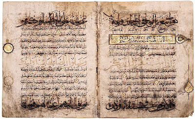
Over time a wide variety of styles of writing Arabic script developed, but not all of these were considered appropriate for copying Qur’ans. Qur’an manuscripts from the first two centuries of Islam were written on parchment in an angular style called Kufic after the Iraqi city of Kufa, an early Muslim capital.
Recent research suggests that the horizontal-format Kufic Qur’ans (cat no. 1–3) were used for recitation in mosques, a practice that probably originated in Iraq, while large vertical-format Kufic Qur’ans would have been placed in cradles (kursis) on display in mosques, possibly in the Hijaz, the area around Mecca in Arabia.1 If this supposition is correct, the evidence for production of horizontal-format Qur’ans in ninth-century North Africa demonstrates the widespread need for such volumes for recitation purposes.
In the tenth century variants of the early squared letter forms began to appear in Qur’an manuscripts from the Maghreb, the western edge of the Islamic world, as well as examples from Iran. A distinctive script developed in North Africa (cat. no. 4) which features nearly circular letter terminals below the line. Rounded script was not new but the application of this style to Qur’ans seems to have begun in Iran and marks a major innovation. Thanks to a secretary in the administration of the Abbasid government called Ibn Muqla, a system of proportions based on the rhombic dot was devised. Ibn Muqla is also credited with the invention of six cursive scripts, thuluth, naskh, rihan, muhaqqaq, tauqi³ and riqa³, which range from monumental to small, and fulfilled different calligraphic purposes. Additionally, regional styles of writing developed. When pages of Qur’ans from different centuries and production centres are exhibited together, the remarkable stylistic variety of Arabic writing becomes evident.
Thanks to the replacement of paper for parchment from the tenth century on, Qur’an production expanded exponentially across the Muslim world. As a result many Qur’ans have survived from the last millennium and we are thus aware of the range of purposes for which these manuscripts were produced. Some very large Qur’ans, written on sheets of paper glued together, would have come from manuscripts intended for display in royal mosques. By contrast, more conventionally shaped Qur’ans may have been for personal use in a domestic setting (cat. nos. 10, 13, 14). Tiny Qur’ans that fit into metal cases would have been worn as amulets and Qur’an scrolls would have been equally portable.
One of the striking features of Qur’ans of all periods is the decorative illumination that appears at the beginning of the manuscript, around chapter (sura) headings, and to mark the fifth and tenth verses within the chapters, consisting of foliate, floral and geometric motifs. Illuminated ornament also varied by period and region. Although gold decoration appears often in early horizontal-format Qur’ans, lapis lazuli blue was combined with gold by the beginning of the eleventh century. In Mamluk Egypt and Syria, Ottoman Turkey, and Timurid and Safavid Iran, lavishly illuminated Qur’ans, sometimes in thirty volumes, were compiled for the rulers and their mosques and madrasas. Qur’ans were also copied on tinted paper, from the ninth or tenth century onward. One of the earliest, most famous examples of this type (cat. no. 2), with gold writing on a blue parchment ground, was produced in ninth-century North Africa.
Great artistic skill has also been lavished on the bindings that enclose and protect Qur’ans. Made of leather and, from the seventeenth century on in Iran and India, of lacquer, these bindings often have Qur’anic verses stamped on the leather exterior and gilded filigree decoration laid over coloured paper on the interior surface. Because of the Islamic prohibition against anthropomorphic or zoomorphic imagery in a religious context, the decoration of such bindings is limited to the floral, epigraphic and geometric.
In architecture Qur’anic inscriptions were carved into stone panels in the form of bands running around the interior or exterior of mosques and other religious edifices. Tile panels and walls of glazed and unglazed bricks also feature Qur’anic verses. The analysis of the choice of Qur’anic verses on specific buildings can lead to a better understanding of the patron’s religious or political preoccupations.2 The large number of tiles from the Il-Khanid period in Iran (13th–14th century), the result of refurbishment and new building after the destruction of the Mongol invasions, indicate a new taste for inscriptions in relief used for mihrabs (prayer niches), tomb markers and wall decoration.
Finally, the power of the Qur’an is so great that its verses are considered capable of protecting people from evil. Thus, amulets and undershirts were inscribed with Qur’anic verses to save the wearer from harm. Even on humble surfaces, a shell (cat. no. 17) or a leaf (cat. no. 19), the word of God was lovingly written, an enduring act of devotion and artistic virtuosity. As if to remind Muslims that God is ubiquitous and all-powerful, the Qur’an in all its forms is a constant presence throughout the Islamic world.
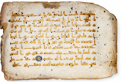
Qur’an folio in gold Kufi script
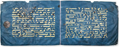
The “Blue Qur’an”
This extraordinary bifolium of gold Kufic calligraphy on indigo-dyed parchment comes from the celebrated “Blue Qur’an”, one of the most lavish Qur’an manuscripts ever created. Careful attention to detail was devoted to every aspect of the manuscript, including the complex and costly technique of chrysography, as described in cat. no. 1. Silver rosettes (now oxidized) were also used to indicate the divisions between the verses. The virtual simplicity of decoration and illumination using the finest materials – indigo-dyed parchment, silver, and gold – combined with the angular Kufic script results in an overwhelming effect on the viewer regardless of his or her level of literacy.Although the two folios are attached, they do not represent sequential pages in the manuscript. Fifteen lines of text fill each page in a dense, angular Kufic script typical of manuscripts attributed to the tenth century (Déroche, 1983, p. 42); no diacritical marks are used to indicate vowels. The calligrapher also inserted cæsuræ within the words in order to place isolated letters at the beginning of the line as much as possible, creating a column effect. The rhythm of the script is made even more striking by the reduction of illuminating elements to a minimum: in the margin of the left folio, an almost obliterated silver rosette marks each group of twenty verses.
Differing views exist as to the exact origins of this manuscript. One scholar has relied on palaeographical and historical evidence to suggest that it was created for the Fatimids, who ruled North Africa from Qayrawan during the first half of the tenth century (Bloom 1986, pp. 59– 65; Bloom 1989, pp. 95–99; Bloom 2007, pp. 42– 44). Another, however, notes that the alphanumeric notation system (abjad), here apparent in the form of letters appearing in medallions at the end of each verse, was subsequently reserved only for the western Islamic world (Stanley 1995, pp. 7–15). The unusual colour scheme may have been inspired by Byzantine manuscripts or documents, some of which are written in silver and gold on parchment dyed blue or purple. The blue and gold decoration of the mihrab at the Great Mosque of Cordoba may also bear some relation to the similar decoration used for the Blue Qur’an.
A section of the manuscript is currently housed in the National Institute of Art and Archaeology in Tunis and detached leaves or fragments are in the National Library, Tunis, the Chester Beatty Library, Dublin, and in other public and private collections.
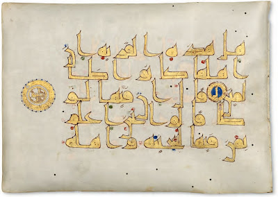
Qur’an folio in gold Kufi script, Iran
The Qur’an to which to which this folio once belonged has often been given a Maghribi attribution because sections of the manuscript were purportedly discovered in the mosque at Qayrawan, Tunisia. However, as the abjad system (by which Arabic letters are used for verse counts) in this Qu’ran has been identified as “eastern,” it is possible that the manuscript was produced in more eastern Islamic lands, perhaps in the greater Iranian world. As with cat. nos. 1 and 2, no expense was spared in the preparation of this Qur’an, which was also calligraphed in gold ink using the technique of chrysography. At only five lines of fine Kufic script per page, the cost of production would have been high, as its completion would have required a proportionately greater amount of vellum, ink, colours, and gold. Like the folio in cat. no. 1, vocalisations appear in the form of red, blue, and green dots. Singular verses are divided by gold rosettes, while every tenth verse receives an abjad letter, echoed in the margin within a larger medallion containing the verse count in gold (in this case, thalathun for “thirtieth”). Other leaves and sections from the same Qur’an can be found in various collections, including the Bibliothèque Nationale, Tunis; the National Institute of Archaeology, Tunis; the Beit al-Quran, Bahrain, and the Nasser D. Khalili collection, London.Qur’an folio in Kufi script, North Africa
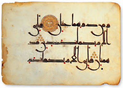
With only three grand lines of elegant and carefully attenuated script per page, the Qur’an to which this folio originally belonged was surely a luxury commission produced at enormous expense. The present leaf relates to folios from two known dispersed manuscripts located in public and private collections, including the National Library, Tunis, Museum of Islamic Arts, Qayrawan, and the Bibliothèque Nationale, Paris, the Al-Sabah Collection, Kuwait, and the Nasser D. Khalili Collection, London. Brown ink was used to calligraph the text against a background of parchment, red to indicate vowels, and gold to illuminate the large medallions and to mark verse endings. The characteristic features shared by all of the folios in the codex include a type of Kufic script notable for its dominant verticals such as the lam-alif combination, countered by an exaggerated width in the strokes of some letters. In the terminal nun (“n”) letters, for instance, the calligrapher has changed the angle of his nib at the mid-point of the round letter, creating an aesthetically pleasing, symmetrical nun that maximises the width of the stroke.It is difficult to date and identify the geographical origins of Kufic-script Qur’ans. A three-line Qur’an folio very similar to this one has been attributed to the first half of the tenth century somewhere between Qayrawan and Damascus (see Fraser and Kwiatkowski 2006, pp. 52– 57; Déroche 1992, pp. 42 and 109).
Folio from the “Qarmathian Qur’an”
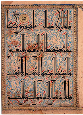
This folio is from a dispersed copy of the so-called “Qarmathian Qur’an,” one of the most elaborate large-scale Qur’an manuscripts produced between the eleventh and early thirteenth centuries. Each page contains four lines of a broken angular cursive script, characterised by towering verticals anchored to a strict horizontal baseline with dramatic modulation between thin and thick strokes. The decoration of each folio is appropriately extravagant. The script is complemented by a detailed background of stylized palmette scrolls in reserve white on a ground of blue curls. These motifs recall contemporary ceramics and metalwork. Lavish gold braided borders frame the text and two half-medallions project into the right margin. The faded gold text panel on the right may have indicated the number of verses in the Sura, or where it was revealed, according to Sheila Blair, who also remarks that such extensive decoration executed on an estimated total of 4,500 pages must have been an extraordinarily time-consuming enterprise (see Blair 2006, p. 198).Qur’an folio (Central Asia, 14th century)
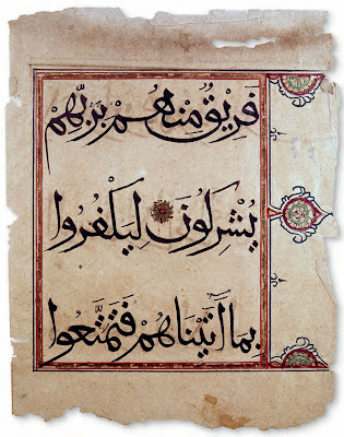
Qur’an production from the eleventh century onwards was marked by a change in the selection of script styles. One of the scripts that gradually replaced the Kufic of earlier Qur’ans as the predominant style was the rectilinear but more monumental muhaqqaq featured on this folio. The earliest known Qur’an written in this script is dated 1160 and can be found in the National Library, Cairo (MS. 144; see Lings and Safadi 1976, cat. no. 60). Three lines of text fill the present page; they are enclosed in a ruled margin outlined in red with multi-petalled rosette extensions rendered in gold, pale green, red, and black and framed in turn within stylised palmettes and half-palmettes. A gold rosette also marks the division between the thirty-third and thirty-fourth verses of al-Rum, the thirtieth chapter of the Qur’an. This folio was formerly in the collection of Krikor and Adrienne Minassian in New York.Qur’an folio from al-Andalus
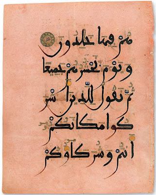
In the western Islamic world, a distinct round style of script with generous, sweeping curves of descending letters had developed by the mid-tenth century (Déroche 1999, pp. 239 – 241; Blair 2006, p. 223). Known as maghribi, this script was employed in al-Andalus and the Maghrib, modern-day Morocco, Algeria and Tunisia. Maghribi-script Qur’ans are usually written in brown or black ink with elaborate illumination in gold. Some, like this one, are on tinted peach-pink paper believed to have been produced in Jativa, site of the earliest documented paper mill in Spain (Fraser and Kwiatkowski 2006, p. 64). The systems used for vocalisation, pointing, and orthography are also peculiar to maghribi script. This Qur’an folio is an elegant example of how the script had evolved by the early thirteenth century.Folio from a Mamluk Qur’an
Qur’ans decorated with illumination and gilding are known to have existed as early as the tenth century, their embellishment at first limited to marking a sura or chapter, as well as the headings and ends of ayas, or verses. On the present folio, the Sura al-Naml is introduced in an elegant white script, outlined in black and placed within a gilded rectangular frame. The frame contains a gold background and a series of lobed cartouches painted in red and blue and decorated with gilded vine scrolls and rosettes. Twelve-petalled rosettes outlined in black and illuminated with gold petals and red dots indicate the end of each verse.The production of such lavish manuscripts required a team of calligraphers, artists, illuminators, and gilders, all contributing to a finished product that often represented the generosity and wealth of the patron who had commissioned it.
While the patron of the codex to which this page belonged is unknown, the manuscript itself can be attributed to Egypt based on stylistic grounds. Its monumental muhaqqaq script is typical of Qur’ans produced under the Mamluks (1250 –1517) in the second half of the fifteenth century; earlier manuscripts would have avoided this script as it was also associated with the Qur’ans of the Ilkhanids (1256 –1353), the Mamluks’ former rivals in Iran).
Illuminated folio (Yemen, 1300-1350)
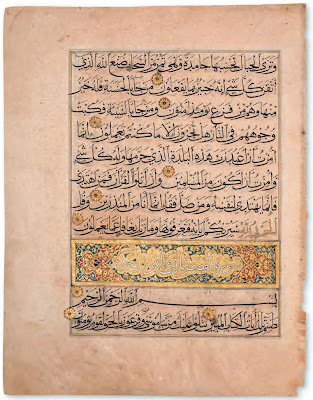
There are varying suggestions as to the geographical location of where this Qur’an may have been produced. Although an Ilkhanid Persia or Mamluk Egypt origin cannot be discounted, this Qur’an has certain features that suggest an alternative place of manufacture: Yemen, during the period of Rasulid rule (1229 –1454). This Qur’an is copied in a combination of three scripts: the first and last lines are in muhaqqaq, the middle line (5th line on the right page and 7th line on the left page) is in gold thuluth, and the remainder of the text is written in black naskh. It is rare to find Mamluk Qur’ans in different types of script, and none are known “with three styles on the same page” (James 1992, p. 160). Another unusual feature is the decoration of the chapter heading: in this case, that of Sura Hud. The text is in white Kufic and this is set within a gold panel with latticework decoration at either end, terminating in a pear-shaped medallion in the outer margin; squares of interlace, although seldom found on Mamluk Qur’ans, are known in Ilkhanid manuscripts, however. The verses on this bifolium – which is sequential – are separated by eight-petalled gold rosettes, with each fifth verse identified “in the margin by a gold pear-shaped device with a floral motif in the centre and an irregular blue border culminating in a long finial” (ibid.); the tenth verse is marked by a gold roundel with a blue border.Qur’an folio in Bihari script
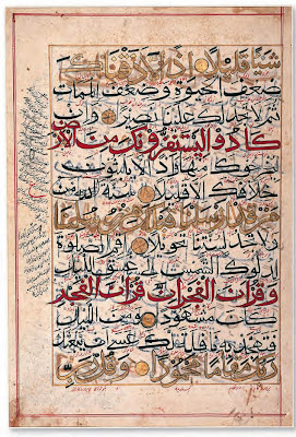
This folio belongs to one of a very few Qur’an manuscripts that survive from the period between Timur’s invasion of northern India in 1398-9 and the founding of the Mughal dynasty in 1526. It has been a challenge to understand the general development of the arts of the book in this region during the fifteenth century due to the diversity of artistic styles corresponding to the cultural centres of independent Muslim sultanates. Manuscript production seemed to follow the Timurid tradition in Iran and Central Asia, with one distinguishing feature: the use of the bihari script, as shown here. A strange mutation of naskh script with obscure origins, bihari appears only in manuscripts predating the Mughals (James 1992b, p. 102). It is characterized by an exaggeration of the sublinear letter forms through a thickening of the letter’s curves and a sharpening of its end points.On the present page, thirteen lines have been calligraphed in gold, red, and black, with black diacritical marks and interlinear Persian translations in red nasta³liq script. The first of every three lines is alternately executed in gold or red ink, outlined in black, followed by two lines of black script. The gilded and coloured lines do not include text that varies in significance from the following lines in black, but the formula creates a visual rhythm that brings a sense of order to a somewhat overpacked page of text. Gold circular pendants separate singular verses and the letter ³ayn, standing for ³asharah (ten) to mark a group of ten verses, appears in the left margin, sandwiched vertically by glosses in black Persian nasta³liq. A clearly visible mistake in the six and seventh lines – additional words that do not appear in the Qur’anic verses have been circled and crossed out after it was too late – suggests that this particular Qur’an was not executed by a scribe of the highest calibre.
Manuscript of a Mauritanian Qur’an
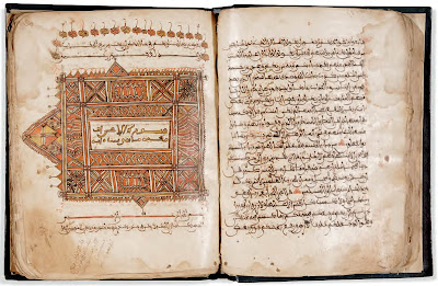
One of the folios appearing at the end of this Qur’an manuscript includes the name of a copyist, Muhammad bin Musa al-Yusufi, and the date the copy was completed (1036 H / 1626 CE). The Qur’an’s illumination, which might be later than the script, suggests an attribution to Mauritania in the 18th century. Other features, such as the characteristic Saharan-Maghribi (or Sudani) script style and a format recalling the square shape of twelfth-century Maghribi manuscripts in a revivalist manner (Bayani, Contadini, and Stanley 1999, p. 43), likewise support a Northwest African provenance.Manuscript of an Ottoman Qur’an
Manuscript of a Safavid Qur’an
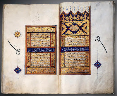
The bifolium that is reproduced here corresponds to the beginning of al-Baqara, the second and longest Sura in the Qur’an. The frontispiece (sarlaw) consists of a rectangular cartouche, surmounted by four identical florets, with alternating dark blue and gold backgrounds scattered with fine flowery foliage. At the centre of the cartouche, a polylobate medallion encircles the title of the Sura, written in riqa³ in white ink on a gold background. The text of the Sura starts beneath this rich frontispiece and runs along in visual discontinuity; the text is divided into panels of unequal width, alternating between two writing styles, different inks and colour backgrounds. Three then five lines of naskh are etched on a white scalloped edge demarcated by a gold background decorated with fine flowery foliage. These alternate with a longer line in muhaqqaq copied in white ink against a blue background outlined in red, or against a gold background outlined in blue. Rectangular cartouches covered with flowery foliage are on either side of the lines in naskh. This visual discontinuity is purely aesthetic and does not signify, for example, the transition from one verse to the next. If the end of a verse occurs mid-line, this is only indicated on this page by a slight space between the words (e.g., the eighth and ninth lines). Outside the written surfaces, medallions punctuate the margins every five verses (with blue rosettes) and ten verses (with gold rosettes).
In the margins, there is a notation made in black ink; this is the Arabic expression waqf which recalls the transformation of this manuscript into an inalienable good (ibid., n. 65). This mark is explained in the founding text which follows the Falnama and which declares that this manuscript was a gift from the Ottoman sultan, Selim II (r. 1566 –1574), to the mosque he founded in Edirne – the Selimiye. It is possible that this luxurious manuscript was one of a number of diplomatic gifts, presented in 1568 by the Safayid sovereign Shah Tahmasp to Selim II to mark the renewal of the peace treaty of Amasya, signed in 1555 with Selim II’s father, Süleyman the Magnificent (ibid., n. 66).
As with many sixteenth century Qur’ans, we do not know the date of this manuscript’s copy, but the calligrapher, or more likely the illuminator, ³Abdallah Shirazi, signed his name at the end of the last Sura. Two miniaturists bearing this name are identifiable: the first worked in the scriptorium of Shah Tahmasp in Qazvin around 1550 –1560 and died in this same city in 1574 (ibid., n. 67); the second, who is better known, worked in the scriptorium of the Safavid prince and governor of Mashhad, Sultan Ibrahim Mirza (1540 –1587) in Qazvin. He died in Mashhad at an unknown date while attached to the service of the mausoleum of Imam Riza and of the tomb of his diseased protector. He contributed notably to the completion of the famous Haft Awrang created for Ibrahim Mirza and a divan for this same prince housed at the Aga Khan Museum. Only a close and careful analysis of the illuminations of these manuscripts and their respective signatures could confirm that the decoration of the Qur’an and of these manuscripts have been done by one and the same person (ibid., n. 68). Whether it was by the first ³Abdallah Shirazi or the second, this sumptuous Qur’an could have been copied and illuminated in the royal and princely workshops of Qazvin or Mashhad.
Manuscript of a Mughal Qur’an
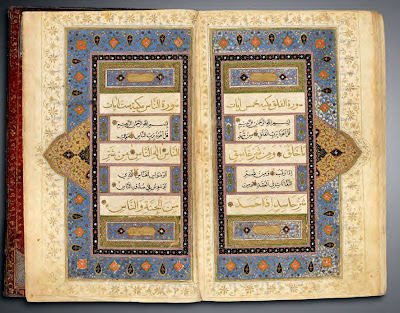
The present manuscript holds approximately 460 leaves and contains thirteen lines per page, with the majority of text copied in naskh and the first, middle, and last lines written in the more monumental muhaqqaq. The margins are ruled in black ink and gold and chapter headings are highlighted in gold muhaqqaq script, while small, multi-petalled and gilded rosettes mark verse divisions. The two pages shown here constitute the middle pair of three sets of illuminated bifolia appearing in the manuscript. Similar to other Qur’ans produced in the later Mughal period, text areas are divided into bands of varied widths, including panels with gilded and inscribed cartouches outlined in red against a blue background filled with small red and white flowers. The bands of text are consolidated within a series of colourful and gilded ruled and floriated narrow frames, enclosed within a larger border containing polychrome vignettes and lotus blossoms among the smaller red and white flowers. This pattern, along with the green-and-gold outlined “hasp” extending from the frame on each side of the double-page composition, is another design typical of seventeenth-century Indian manuscripts; it is repeated in panels flanking each of the smaller text boxes containing black naskh script. A gold, floriated scroll pattern fills the margins, surrounding the overall illuminated composition, its rhythm broken at one point by the gilded and polychrome-bordered cartouche appearing on the right margin of the right-hand page.
Persian manuscripts of the fifteenth and sixteenth centuries appear to have been a great source of inspiration for Qur’an illumination in seventeenth-century India, this manuscript, however, being an exception (ibid., pp. 174, 194 –200), although the combination of small and large scripts on one page is reminiscent of Qur’ans produced in Shiraz, Iran, in the sixteenth century.
A colophon provides information about the scribe, a certain Muhammad Fazil who identifies himself as a shagird, or pupil, of Mulla al-Yas, along with the manuscript’s completion date, Jumada al-awwal 1093 H / May –June 1682 CE.
Manuscript of a Qajar Qur’an
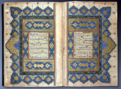
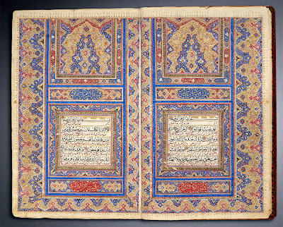
The manuscript includes the entire text of the Qur’an, copied in Arabic in a combination of naskh and thuluth scripts. On the double-page illuminated frontispiece shown here, verses from the first chapter and part of the second are highlighted by frames created with gilded cloud forms while interlinear Persian translations appear in the narrower bands in a dark pink nasta³liq. Central cartouches above the text frame on each page provide the name and number of verses contained in each chapter in red naskh script (seven for al-Fatiha and 286 for al-Baqara). A ruled pink lozenge scroll frames the text and is surrounded by polychrome gilded illumination composed of projecting polychrome half-medallions filled with heart-shaped knots and orange, pink and blue floral rosettes set against a blue background. The colophon on folio 302r identifies “the humble scribe,” ³Abd al-Mudhnab al-Khatti al-Jani ³Abdallah and gives the date of 1233 H / 1817- 8 CE, but it appears that another colophon was added on the verso of the same folio, with a later date.
Manuscript of a Sulawesi Qur’an
The Aga Khan Museum’s Qur’an is one of the most impressive of this group in size, quality, and condition; it survives in its complete form and contains a full colophon identifying its scribe and attesting to a production in south Sulawesi. It was written in thuluth script with explicatory glosses added in naskh. The Sura heading appears at the top of the right-hand page in an oval cartouche painted in black, while the number of verses in the chapter (110) is given in the matching cartouche at the bottom of the same page. The cartouches on the opposite page provide the numbers of verses (110) and words (1877) in the Sura, as well as the number of letters (6360) in the chapter and its order of revelation to the Prophet (67th), respectively.
The extraordinary amount of artistic variation among these manuscripts and the fact that they reflect far-flung provenances and locations has led some scholars to propose the existence of a diasporic artistic idiom rather than one restricted to south Sulawesi.
Source: The Aga Khan Museum



0 comments:
Post a Comment